We Interrupt Our Regularly-Scheduled Program…
Rather than talking about HOW to do things with data, let’s start the new year by spending some time on WHY we care about data investments in the first place.
“BORING,” I hear you say, but au contraire! Even though most of your colleagues have accepted that data is the “trendy” thing, that doesn’t mean they “get it.” And if they don’t get it, they won’t support (or reward!) you properly.
My goal with this article, then, is to help you convince your colleagues that Power BI (and/or Power Pivot and Power Query) is worth the investment – a hundred times over, actually. Use this as ammunition.
So if you find yourself saying “hey Rob I already knew all of this,” that’s OK – I’m not talking to the data gene folks here. For once I’m tailoring these messages to the other 15 out of 16. (And hey, maybe even you data gene types will take some new ideas away from reading these.)
Principles Guiding this Article
Before diving in to the list itself, it’s important to let you know where I’m coming from. Here are the principles that I’ll be following as I go through said list:
- If you can’t explain it simply, you don’t understand it well enough yet. I believe in that principle, firmly. So I’m deliberately going to keep things “Fisher-Price” – no jargon, no esoteric examples. Just elementary-school-level explanations and illustrations, because defanging complexity is the first step to defeating it.
- I’m assuming that your organization has the standard problems. And this is actually a surprisingly safe assumption, because we’ve found, over the years, that while the specifics vary quite a bit, the fundamental issues are the same old stories, over and over again. Everyone tends to think “MY organization is uniquely dysfunctional,” but nope – everyone is struggling with the same handful of problems – and those problems are precisely what inform this list.
- The ten benefits in this list are well within your organizations’ reach. You likely already have the right people. You don’t need to hire (or become) rocket scientists. You just need a new toolset and a few tweaks to the workflows.
- The ten benefits are cumulative, not mutually exclusive. As in, you can do more than one at a time, and reap massive value. Each one is a big deal on its own, but when you start piling them up, they actually multiply each others’ value.
- All ten benefits are readily achievable with the Microsoft suite of tools. In fact, it’s our years spent applying those tools (Power Pivot, and more recently Power Query and Power BI that have taught us these benefits. I’m sure you can achieve some degree of these benefits with other tools too, but my personal experience is that the competitive tools are more sizzle than steak (and the MS tools vice versa).
OK, onwards to the list!
Benefit #1: Subdivide and Segment for Effective Action
You know those reports which tell you how things are going “overall?” The ones which give you ONE set of numbers to represent the entire business? The ones which lack filter and drilldown? Those are super common. We see them everywhere we go (heck, I even saw one on vacation in Florida last week). Well, they are LYING to you…
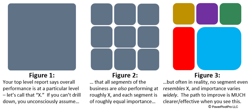
Do you know what Fig. 1 and Fig. 3 have in common? They both have the exact same average color! That’s right, the color we call “X” in Fig 1 has an RGB of 96,114,134. And the average of the RGB’s in figure 3 (weighted by their respective areas) is also 96,114,134!
Well the same thing happens in real life: the top-level average ALWAYS obscures critically-important variation under the surface. Whether we’re talking about employees, locations, products, services, customers, website visitors… you name it. Even if some segments are performing precisely in-line with the overall average, there are other (and important!) segments which are divergent – and in both positive and negative directions.
Yes, the top-level average IS important! It tells you, after all, where the entire business is heading. Do we even have a problem, overall? Are we trending better or worse? Crucially important to know these things, of course!
But accurate and effective ACTION – aimed at improvement – REQUIRES you to drill down. Poorly-performing segments, for instance, are the most important to address – why spend time and effort “squeezing” corners of the business that aren’t a problem, and which have less room for improvement? You may end up even demotivating top performers that way (if the segmentation corresponds to people, which it often does). No, you need to focus on the problem spots. And not all problem spots have the same problem – they may need a few different approaches.
As an aside, maybe drilling into the healthy places is a good way to discover HOW they are performing well in the first place! (And vice versa – you’ll learn a lot from following up on the underperforming segments as well).
Here’s a clearer way to say it: if you’re trying to improve the numbers on the top-level report, and you’re doing that without drilling down, you’re on a fool’s mission. Take a step back, breathe, and trust me: it’s going to be ok. It’s not hard to produce the subdivided picture, especially not with the Power BI / Power Pivot toolset. The time spent getting started is not “lost,” but the time you’re spending “squeezing” the whole biz… yes, that IS lost effort, so stop it.
Benefit #2: Get the Whole Picture in One Place (aka “Stop Drowning in Reports”)
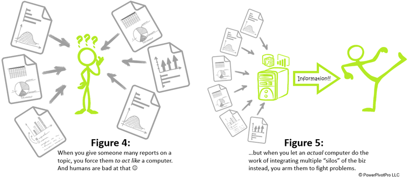
One of the ways that “data” can get a bad reputation is that too often, we are drowning in it. Here’s an example: one of our favorite clients told us, at the beginning of our engagement, that certain managers at their company were receiving hundreds of reports per day… on a SINGLE TOPIC (customer satisfaction, in this example).
Hundreds of reports per day! Good gravy how does that HAPPEN? Well, one factor of course is that traditional SQL-based reports lack drilldown and filter (see Benefit #1), and the “fix” for that weakness is to generate one report for each filter you care about. Also, there are often multiple source systems containing relevant information on a single topic, and these “silos” of data lead to “silos” of reports (because traditional tools struggle to “see” more than one source system at a time).
And it doesn’t have to be hundreds of reports to be a problem. Frankly, even five is enough to overwhelm the human brain. We’re just not built to be computers.
But when you put all of the relevant information in one place, you allow the human/business brain to work as designed (i.e. read, think, act) – as opposed to like a computer (read, remember, switch reports, read, remember…) And that’s all the difference in the world.
The client in this example is now saving $25 million a year, and can prove it. Collectively, we unified the disparate silos of data into a single scorecard. And that’s the difference between “no one has ANY IDEA how they’re doing” and “everyone knows PRECISELY how they’re doing, AND where/how they can improve.”
Speaking of scorecards…
Benefit #3: Drive Org-Wide Behavior Change with Scorecards
Many problems/opportunities can ONLY be addressed by making thousands of small behavior changes, on an ongoing basis, out in the “trenches.” In other words, there are some which CANNOT be addressed by a small number of smart decisions made at the top of the org. Improved pricing behavior by the sales force for instance. Improved quality of service by field technicians, for another.
How do you make that happen? How do you influence a large number of people to behave differently on an ongoing basis, especially when they operate at a distance (both organizationally and physically) from you?
Fancy management consulting firms charge six-seven figures to do this, but with Power BI and/or Power Pivot, it’s no longer necessary to make that outlay. We’ve seen organizations crack this nut with in-house resources, modest budgets, and short timelines – even though the impact is absolutely enterprise-wide. It takes some thought and iteration, for sure, but primarily, you “just” need to build a good scorecard.
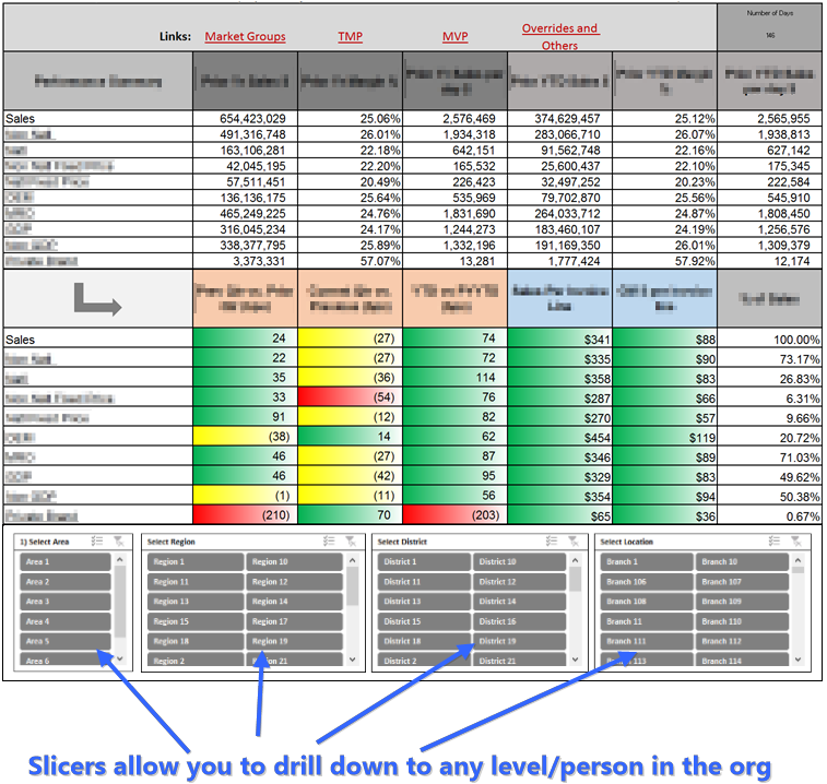
A redacted/anonymized example of one of those scorecards appears below. We enjoyed working with this particular client immensely. Few things are more satisfying than helping people to solve an “unsolvable” problem, adding millions to the bottom line, and leaving their colleagues wondering “how exactly did they DO that??”
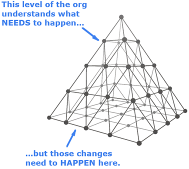
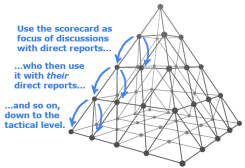
And how does this work in practice? Each manager sits down with their direct reports, usually individually, and goes over the “target” metrics (the color-coded ones) and discuss action plans to turn the red and yellow ones green, while consulting the secondary (non-colored) metrics for a more complete picture. At higher levels of the org, those direct reports are managers also, and so they repeat this process on down the pyramid.
Notice the Subdivide and Segment theme here? That’s no accident – I told you these ten things are cumulative in their value! And guess what? A good scorecard often also “channels” Benefit #2 (Get the Whole Picture in One Place). And there are 7 more Benefits to come!
A unified scorecard is a powerful tool for positive change, and while “peak hype” for scorecards happened probably 10+ years ago, today’s modern tools have put it well within your reach. The Good Idea of yesterday was in fact Good, but technology has finally caught up with it and made it widely accessible and practicable.
Benefit #4: Eliminate Confusion. Achieve One Version of the Truth.
 Talking about unified scorecards transitions nicely into the next benefit: unifying ALL data-driven information, period. Central IT/BI can never, ever keep up with all the needs of the business, so the business is forced to produce their own reports. That in itself is not fundamentally a bad thing, but the fragmentation that follows? Not so great. Even the definition of supposedly-simple concepts like profitability end up drifting when implemented hundreds of individual times, and that’s before we get into outright mistakes and/or deliberate deception.
“My spreadsheet can beat up your spreadsheet.” You know this game? The one where each manager shows up to the meeting with a completely different spreadsheet, each of which is purported to measure the same set of metrics, but they all return different numbers for the same things? Then the meeting devolves into figuring out whose numbers are correct, rather than the original agenda.
With Power BI (and/or Power Pivot), the ability to generate single authoritative (and well-audited) models, and publish them centrally, is finally in the hands of the Business. Responsible behavior, efficiency, and everyone pulling in the same direction. Even IT should rejoice!
Benefit #5: Free Your Valuable Thinkers from “Spreadsheet Debt Service”
“For someone who is good at Excel, one of the worst things they can ever do for themselves is to create a spreadsheet that is truly useful.” That’s a joke I tell in my live classes, but it’s based 100% in truth, because anything that’s valuable to the team will require continuous maintenance – and the only way for its creator to escape that responsibility is literally to change jobs.
“Debt service” is a concept from the finance world, and loosely speaking it’s the total cost of interest on all the loans you carry. There comes a critical level – for an organization or individual – at which the total cost of debt service becomes too high, as a % of total available income/revenue, and after that, the debtor falls into a death spiral, and they get crushed by their debt.
I think there’s a very strong parallel in the world of spreadsheet-driven analysis and reporting, which is where the business world overwhelmingly lives to this day. The time spent pumping the latest data through these workbooks, as well as making “small” modifications on behalf of their colleagues (cough cough, subdividing and segmenting, anyone?)… it piles up. And sooner than we’d like, an incredibly-valuable employee and teammate is now spending the majority of their time simply “servicing” their portfolio of spreadsheets!
If you manage one or more of these people, or otherwise depend on them for information, it can be quite confusing and frustrating – “why can’t my people do any more new work?” It even gets uncomfortable – because “non-Excel people” can’t fathom what’s actually going on in these spreadsheets, there’s little chance of explaining it without sowing the seeds of doubt – is the Excel guru bad at their job? Have they become lazy? I’ve seen these perceptions seeping in around the edges many times. But trust me, your Excel gurus’ pushback is legitimate – there truly IS a breaking point past which your skilled data people simply are “full,” and cannot take on any significant new work.
Now to be clear, I’m talking about traditional Excel here, not “Modern Excel,” because the latter benefits from the Power BI technologies of Power Pivot and Power Query. Auto-refresh can keep their reports/dashboards up to date with literally ZERO intervention. In fact, the organization will remain informed with the latest and greatest, even if “the creator” is on vacation. And we’ve already covered the Subdivide and Segment benefit, which means that they can update instantly produce new takes, and answer new questions, without re-inventing the wheel (which is what traditional Excel forces them to do).
Without hiring a single new person, you can MULTIPLY the work capacity of your data-driven thinkers and purveyors of information. It’s like “getting them back” again – remember those days before they started saying no? Of course, the people you will “get back” are FAR more capable than even a team 4x the size as before, working with the old tools.
Benefit #6: Employ “Fair” Metrics for an Undistorted Reality (aka Apples to Apples)
 The following are all inspired by real examples we’ve encountered in our work:
- “We’ve sold 17% more dollars of product X this year! We should stock more products like that.”
- “Sales were down 9% in February, but that’s expected because February is 10% shorter than January.”
- “Website traffic was down in April, significantly, looks like those changes we made to the site were a mistake.”
- “We sell nearly twice as many dollars of Service A as we do Service B, shouldn’t we push Service A more than Service B?”
Well, in reality, there were extenuating circumstances distorting each of those pictures. Respectively:
- Product X was stocked in 25% more stores this year than last, AND the unit price went up 4%, so in reality, units per store were down significantly, rather than up, indicating that consumer preference might be shifting AWAY from this product.
- Once you account for weekends and holidays, in that particular year, Feb and Jan BOTH had 20 “open for biz” days, so on a per-day basis, Feb WAS in fact terrible.
- April is a “down” month for this segment of the web EVERY year (thanks to Spring Break), so on a year-over-year basis, this was expected rather than a crisis.
- In terms of margin (revenue minus the “wholesales” cost of the service), Services A and B are nearly-identical, so maybe leave them alone, or perhaps “favor” Service B rather than A given its higher margin percentage.
More often than not, raw revenue dollar figures paint a distorted picture, so why is “Revenue $” so often the first column in our reports and dashboards? Well, only because it’s the easiest thing to count. Our accounting and billing systems already deal with precisely those numbers, so we get them in that form to begin with. And with older tools, it’s simply just… exhausting to perform multi-source/multi-variable calculations (ex: divide by number of days we were open for biz). Not so with the new tools!
Subtracting cost to serve, dividing by number of days we’re open, etc. isn’t rocket science – far from it! It’s just a failing of the old tools. I love telling people that for a living, I perform analytics that return millions of dollars of ROI in short order, and yet 99.9% of the time, the math employed never goes beyond 5th grade level. The modern tools aren’t better at math, they just make things infinitely more convenient – they let you feed the right numbers into your usually-simple math at the right time. Revolutionary! Kinda begs the question doesn’t it… what took so long? (Short answer: in this case, the software industry was the tail that wagged the real world’s dog, but that’s a tale for another day).
Are undistorted metrics crucial to good scorecards? You betcha! And being able to subdivide and segment your undistorted metrics is important too, as is seeing undistorted metrics from multiple facets of the business in one place, etc. Getting the spirit of this game yet? It’s all one big network of wins – each one relatively simple, but the cumulative effect is a Megawin. (That’s a real metric-system term for “a million wins.” Seriously, you can look it up. OK, fine, I made it up.)
(BTW, the importance of undistorted metrics is one big reason why I’ve long believed that visualization is the crucial last mile, but it’s only as good as the metrics you feed into it. Visualizing distorted metrics is essentially the art of “Getting Deceived Even Faster!” So buyer beware of anyone telling you that “viz” is THE key.)
#7: Foster a Virtuous Cycle – A Culture of Better Questions
 I love how naturally these benefits “flow” from one to the next. Imagine that you’ve done the following.
- Given your analysts and data-driven thinkers a lot more time back – time that they can use to innovate (Benefit 5)
- Whetted everyone’s appetites for compact convenience (Benefit 2) and trained them to always expect they can drill down under any number (Benefit 1).
- Conditioned everyone to start asking “but hey, is this metric distorting the picture?” (Benefit 6)
- Transformed data-driven meetings from free-for-alls into focused conversations (Benefit 4).
Once you’ve reached a certain critical mass (in terms of participants who’ve seen the light), those conditions lead to a steady and sustained acceleration – an ongoing improvement in the quality of thought in your organization. People see an example of smarter metrics, for instance, and once the value dawns on them, they want to apply that same kind of thinking on other problems. Which inspires someone else, and on down the line. And then some day, someone revisits the original smart metrics and says “hey I bet we can improve these too!” It happens. We’ve seen it repeatedly. And heck, it even happens with our own internal analytics.
The data tools have long limited the questions we can answer, which has in turn subconsciously limited the questions we ask. Once you take the restrictions off, it takes some time for humans to explore those unseen “regions” in their minds and in the business. I call it “tearing down the invisible prison.”
And isn’t this what it’s all about? Data tools aren’t the goal, better and more effective thinking is! (And action informed by that thinking, of course). If you wanted to argue that Benefit 7 is the biggest one, I wouldn’t disagree.
#8: Know Whether Something Helped or Hurt (aka Forensics)
This one is perhaps obvious once Undistorted Metrics and Subdivide/Segment are second nature, but it’s such a common (and valuable) sort of question that it makes the list.
So you’ve made some sort of change in the business, and now you need to know – did it help or hurt? Well, sometimes it’s so hard to measure such a thing that organizations just flat-out skip it. They just trust/hope that it helped. (Happens more than you’d think). But even more commonly, the “help or hurt” analysis takes the form of a single top-level (non-subdividable) report populated with raw (“unfair”) metrics.
Yeah, well… if you’re doing it that old way, you may as well flip a coin. If the overall report says “meh, it had no impact,” that might be masking the reality that a few segments WERE very positively impacted – and you miss a crucial detail that could have been replicated business-wide. Furthermore, if you’re using raw/dumb metrics, you might be misled by basic seasonality (or some other fluctuation of the calendar). On net, the impact can be enough to make a positive change look negative, or vice versa.
Well you don’t have to be satisfied with looking at the world through lenses caked with mud. Not anymore anyway.
And hey, maybe along the way, you’ll inspire others in the org to perform more rigorous forensic testing of their initiatives, too. You know… a virtuous cycle kind of thing…
#9: Deploy “Tripwires” – Exceptions and Alerts
 Two of my all-time favorite blog posts – Movers and Fakers and Sara Problem – are examples of this benefit, and I’m tempted to get lazy here and just say “go skim those, I’ve been writing this for 20+ hours now and I’m getting tired.” But no, I’m powering through! Where’s that coffee pot…
Even in an environment where you’ve fully embraced Benefits 1-8, there’s still a weakness waiting to trip you up from time to time. Specifically, even with a concise and smart set of dashboards, humans don’t have time to drill down into said dashboards in every possible way, nor can they do so every time the data gets refreshed. Because of that, you can miss things.
EX: I once heard a horror story about a hospital surgery department that accidentally stopped billing patients for anesthesia. This was a bug in the billing system and had nothing to do with analytics, but… analytics didn’t catch it either. Whoops. Surgeries were still happening, and bills were being sent (for the hospital stay, for the surgeons’ time, etc.) – but the bills were “light” by some significant percentage. For months. I’m sure there was some report somewhere that, if someone were monitoring it, they would have seen the problem. But clearly… that wasn’t happening.
Imagine instead if there had been a robotic “Night Watchman” in place – watching, tirelessly, for some exceptional change in either direction. (This is precisely what the Movers and Fakers post is about, btw, maybe you should go read it heh heh).
Well, the Power BI suite and its cousin Power Pivot in Excel let you do precisely that – email you when something fishy happens. And while Power BI has some built-in capabilities here, I personally prefer the full-flexibility, formula-based approach enabled by Power Update. You can even set it up to drill down in thousands of different ways, looking for exceptions at the drilled-down level, or even in combinations like “are there any Location-Product pairings that are spiking or plummeting this week?”
Now that hospital example, while authentic and attention-grabbing, is more extreme than it needs to be. You don’t need something that big and obvious though – every week there are things we COULD see in our dashboards if we happened to look in the right places, but don’t. Sometimes the exceptions are positive too. Wouldn’t it be nice to know about those as well, so you can try to replicate them less randomly?
#10: Don’t Stop at “Inform.” Directly Advise Decisions!
Let’s start with a controversial statement: informing people is 100% worthless. Does that raise your hackles? Well, here’s the follow-up: what we do with data has zero value unless or until it translates into ACTION – into better decisions and improvements. Aha! That makes it a trivially-true statement rather than a controversial one, but if you keep that principle clearly in mind, it forever changes your approach to data.
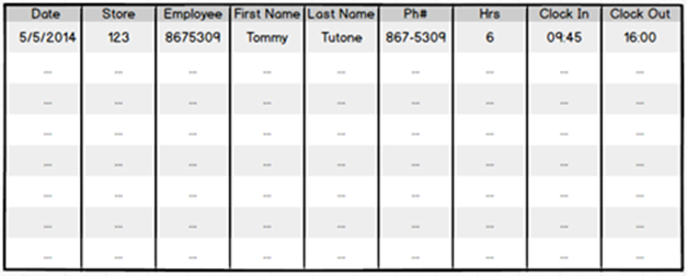
Let’s do this by example: I once was asked to troubleshoot a report that was running slowly. It was a PivotTable powered by Power Pivot, so it should have been fast. But when I looked at it, the pivot itself was more than 100,000 rows long! Not the source data. The “report” itself! And it looked something like this…
The So-Called “Timecard Report.”
Imagine 100k Rows of This – Not Source Data. This Was the End Report.
OK, so, first of all, if it doesn’t fit on one screen, it kinda doesn’t exist. Stuff that vanishes “below the fold” will almost never be seen, and chances are also decent that even the rows above the fold are too detailed/noisy to be of value. Don’t do this. Ever. It boggles my mind, to this day, that there were human beings staring at this.
But the purpose of this “timecard report” was even more fascinating. There were dozens of regional managers consulting this, multiple times per day, to see if there were any stores that were empty – as in, no employees showed up for work, and the store is sitting there dark, not generating revenue.
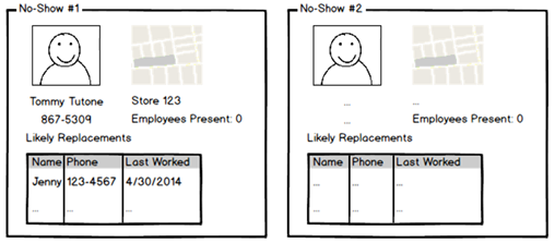
They didn’t need a “timecard report” – they needed the Empty Store Detector. It could look something like this…
This Whole Thing Would be Empty if All Stores Were Good
(Note the information that directly facilitates the follow-up action of getting in touch
with the missing employee and/or finding a replacement.)
This is a very powerful concept. It deserves more space than this, and in fact, another one of my favorite blog posts, We Have a Crush on Verblike Reports, awaits you if you’re curious. Which hopefully you are ![]()
Honorable Mentions
A few benefits that didn’t make this list, but more because they wouldn’t “compress” well into a longer list, rather than as a reflection of their value:
- Forecasting and Planning – imagine how much better these processes can be if they are “bedrocked” on a far more nimble, accurate, and trustworthy set of analytics. More articles on this in the future.
- What If Analysis – a close cousin of forecasting and planning, you can very readily experiment with various scenarios (ex: interest rates rise by X, price of oil falls by Y, exchange rates fluctuate, you outsource a job function, etc.) without actually “living” them.
- Facilitating Better IT/Biz Relations – these tools, unlike their forbears, actually incent and reward cooperation between IT and the business. The longstanding friction between the two is a direct result of the poor tools available much more so than a clash of personalities – at least when it comes to my sphere of operation (data, analytics, BI, whatever you want to call it these days).
- Finding Hidden Correlations – this one falls more under the machine learning/data science heading, and therefore “mushrooms” into its own top ten list, so I stayed clear. Besides, I see this as the sort of thing you do once you get the “basics” mastered – which very few organizations have done at this point in time. Get your org deep into the ten benefits above and THEN proceed to the next level – but by that time, you will have already reaped MASSIVE benefits.
Reactions?
I’m even more curious than usual what you think of this article, so please drop me a comment. Was it helpful? Too obvious? Can you imagine using its messages to help get colleagues bought in? (And if you do that, DEFINITELY report back!) Did I miss one that you can’t believe I excluded? Are there ones you hadn’t thought of this way before? Examples of where these have succeeded or failed?
Drop me a comment. I intend to be active in the comment thread – but only if you are ![]()
Thanks for reading this far, and I hope you are having a great start to 2017.
